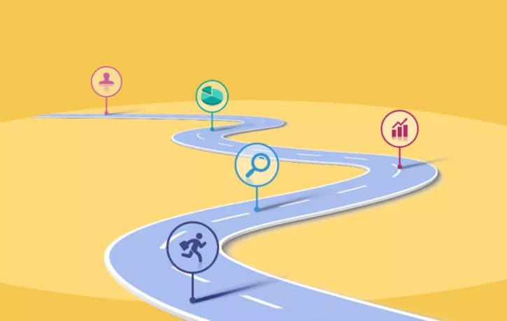
A seamless user experience is critical for boosting conversions and preventing cart abandonment. But constructing the ideal user journey is more than simply creating an aesthetically pleasing website.
Instantly improve your user journey. Discover how.
For instance, a beautifully designed website might look nice to prospective customers. But if they can’t find the search bar or struggle to complete the steps to make a purchase, poor UX will ultimately prevail. You’ll lose the customer.
What is a user journey?

A user journey is the series of steps or path a user takes on a website or mobile app. A successful journey effectively guides a user to complete a certain process or task.
For example, the user journey on online retail shops is designed to encourage purchases. The user path on a blog might guide readers to subscribe to an email newsletter.
An ideal user journey includes the crucial elements of a positive user experience:
- Easy usability
- Apparent value of the actual products or information on your site
- Simple and intuitive website navigation from the beginning through the end of the journey
4 steps for designing an excellent user journey on your website or mobile app
When designing your website or app, it’s important to consider the steps a user is likely to take before arriving at their destination, whether that’s making a purchase, subscribing to a newsletter, or filling out a form.
A positive experience navigating through your platform can delight your users and keep them coming back. Here’s how to achieve the ideal user journey.
1. Outline your vision for a positive user experience

Before diving directly into designing your user journey, consider which elements contribute to a positive versus negative online experience.
For example, click fatigue, poor website navigation, clutter or hidden menus often result in user confusion or irritation. You want to ensure your design doesn’t frustrate users, but instead guides them along a carefully crafted path.
Begin by considering the simplest and most logical way of showcasing your company’s mission, products or community. As you continue plotting each point along the user journey, assess whether the navigation is coherent and intuitive.
2. Make the user journey reflect a specific goal
A user journey has a beginning, middle, and end. To ensure each part of the journey fulfills its purpose, consider the following questions:
- What is the overall purpose of your website or app?
- What goal do you want your user to accomplish at the end of their journey?
- When someone enters your site or app, does the first thing they see fit the “beginning” you wish to create?
- Can they easily move from the beginning to the “middle” of the journey, whether that’s browsing items to purchase, researching, etc.?
- Last and most important, is it easy to go from middle to “end,” where users would subscribe, complete a purchase, request a demo, or take another action?
This final step is crucial to seeing results in both profits and retention.
3. Look at what you offer through the user’s eyes.

Answering the questions above is important, but you must also be able to answer questions from your users’ perspective as well.
- What are users doing on your site or app?
- What do they want to accomplish?
- What is motivating them to continue engaging through each step?
Businesses often lose their audience somewhere along the user journey because they lack understanding of what users really want.
But if you can keep these questions in mind while designing the user journey, you will be able to give your users what they’re seeking.
4. Provide personalized website navigation support
If we had to pick one element of UX to focus on when creating a user journey, it’s website navigation.
Nothing frustrates users more than not being able to find what they’re looking for on your website. But with personalized, on-screen, contextual guidance, you can be sure that users will always find what they’re looking for as quickly and easily as possible.
A Digital Adoption Platform (DAP) is an invaluable tool for websites and apps because it provides step-by-step guidance along the user journey. It helps guarantee a positive user experience and ultimately, aids conversions.

