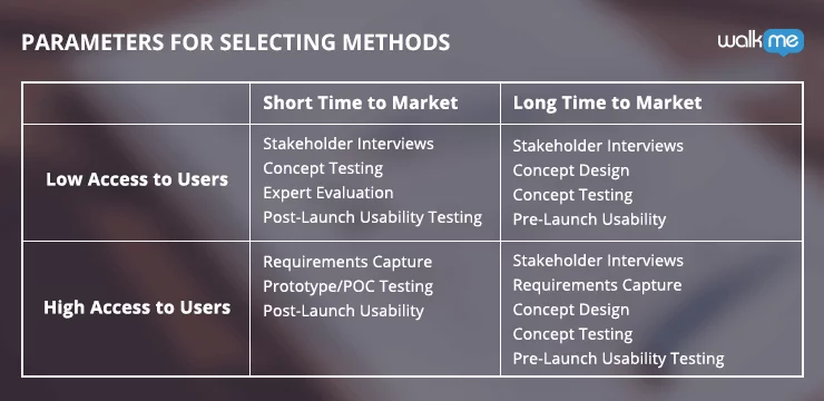
Testing usability is best done with real users. Even if your time to market is short, having high access to users is an advantage that you’ll want to capitalize on.
In these circumstances you’ll want to pursue UX methods fit for getting the most of your access to users in the shortest amount of time. And fortunately, there’s a UX Combo just for that.
 UX Combos are sets of UX methods aimed to get the best results after factoring in limitations in access to users and time to market. You can learn more about UX Combos by reading the following articles:
What’s Your UX Combo?
Part 1: UX Methods for a Short Time to Market and Low Access to Users
Part 2: UX Methods for a Long Time to Market and High Access to Users
Part 3: UX Methods for a Short Time to Market and High Access to Users
Part 4: UX Methods for a Long Time to Market and Low Access to Users
 In this post, we will be discussing the UX Combo for when a product team has high access to users and a short time market.
The challenges you’ll face with a short time to market include having enough time to organize the sessions with your users, and scheduling time to implement the results once your findings are gathered.
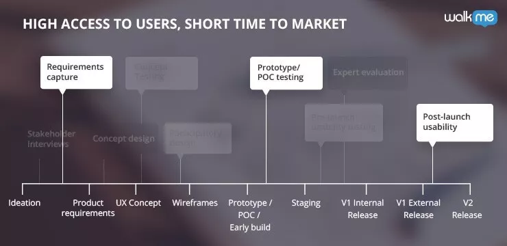
For these reasons, the following three UX methods are your best bet for getting a good understanding of your users’ functional requirements, and their unbiased product feedback, within your time frame.


But first, What is a UX Combo?
 UX Combos are sets of UX methods aimed to get the best results after factoring in limitations in access to users and time to market. You can learn more about UX Combos by reading the following articles:
What’s Your UX Combo?
Part 1: UX Methods for a Short Time to Market and Low Access to Users
Part 2: UX Methods for a Long Time to Market and High Access to Users
Part 3: UX Methods for a Short Time to Market and High Access to Users
Part 4: UX Methods for a Long Time to Market and Low Access to Users
UX Methods for High Access to Users & Short Time to Market
 In this post, we will be discussing the UX Combo for when a product team has high access to users and a short time market.
The challenges you’ll face with a short time to market include having enough time to organize the sessions with your users, and scheduling time to implement the results once your findings are gathered.
For these reasons, the following three UX methods are your best bet for getting a good understanding of your users’ functional requirements, and their unbiased product feedback, within your time frame.
- Requirements Capture
- Prototype/POC Testing
- Post-Launch Usability Testing
First UX Method: Requirements Capture
To conduct a requirements capture, you will need to interview users within their context of use, to understand functional requirements of your product.Good UX is easy with WalkMe’s step-by-step guidance platform. Try it today.
Before You Start
Arrange interviews with individuals that represent your main users. If, within your limited time frame, you can arrange interviews with individuals who represent other segments such as potential users, new users, and even users who reject the product you’ll be able to broaden your understanding of different needs. But, prioritize the users that you depend on most for success. Try to arrange these interviews at the user’s location to be able to collect more information on the context of usage. Come to each interview with a prepared and clear agenda to keep the meetings short and focused. Begin by asking questions about their background and domain knowledge to get an understanding of who they are, how familiar they are with the product and if they are part of your target audience.Limitations
A requirements capture will typically deliver WHAT the users need, but not HOW they want it. Your concept testing and post-launch usability testing later on should cover the shortcomings of this stage. During a requirements capture, taking notes and summarizing the session can be challenging. Requirements captures are “wordy” processes and require that you are prepared to record and log the information you receive, ideally as soon as the session ends.What to Focus On
The focus of your requirements capture should be on understanding the context of use. Ask questions that help you understand:- What role the product plays in their work or lifestyle
- The time of day and duration they are using your product
- What impedes, distracts, or constrains their experience
- Happy
- Confused
- Lose interest
- Frustrated
- Want more
What You Gain
After conducting requirements capture sessions, you will be able to deliver:- An understanding of your product requirements within the context of how they will be used
- A deeper understanding of user needs
- A prioritized list of requirements
- Requirements for each agreed persona

Second UX Method: Prototype/POC Testing
Once you have an (at least semi-) working prototype, you are ready to conduct usability testing. Test your product by allowing real users to complete tasks while you observe. It was already recognized in the previous UX method, that you will have limited information on how users will want to complete tasks. This is your opportunity to fill in this knowledge gap, but it is only worthwhile if you have enough time to implement your results.Before You Start
With a fast-approaching deadline, you’ll need to carefully plan enough time to recruit users, conduct testing, analyze and implement findings within the timeline of development, to have your prototype in the first place. Plan how you will record these sessions. Oftentimes, it is helpful to bring in a second product designer or product manager to capture user feedback and to make observations throughout. Also having a developer there will help minimize the time it takes R&D teams to digest and implement your results.Limitations
There is a lot to learn from prototype/POC testing, but the information won’t be true to how a user behaves outside of a lab environment. It will take a lot of time to set up and conduct these sessions, and after, you should have a likely overwhelming amount of information to work with. If not prioritized properly, you won’t be able to make the most of the information you have.What to Focus On
Begin each session with an understanding of the participant’s characteristics, their existing knowledge of the product, and the context they use the product in. Capture their first impression within the first few seconds of exposure. This will help you determine what is most obvious about the product, and what approach it conveys. While participants complete tasks, have them think aloud so you can follow their train of thought and the logic behind their usage. Before the session ends, clarify with the user what the highs and lows were of their experience. This is a good way to evaluate what ‘sticks’ from the experience, for the good and for the bad.What You Gain
By conducting prototype/POC testing with just five or six target market participants, you will be able to:- Deeply understand why users do or do not take specific actions
- Identify roughly 50-60% of your user experience issues

Third UX Method: Post-Launch Usability Testing
Rinse and repeat: In practice, post-launch usability testing is conducted in a similar manner to prototype/POC testing. The difference is that your post-launch testing is done on a fully working product, rather than a limited prototype This actually makes a difference. While the first usually allows you to gain understanding regarding the main flow and concept, the latter caters for testing the complete end-to-end experience. Here you have a chance to review the feature within its environment (site/app), test alternative users paths, and record reaction to error messages and other lower level details that were probably missing from the prototype/POC. The set of findings generated from this robust method, will also challenge your prioritization skills. With 5-6 users (at least), you’re likely to get a significant number of issues that you’ll need to group and prioritize towards the next development sprint. It is highly recommended to get another pair of eyes (e.g. product designer, researcher, manager, etc.) to help balance your biases towards the required changes. This will also help in coming up with solutions that you may have skipped.Try WalkMe’s digital guidance platform today to boost your UX.


