For companies that rely on their online presence to bring new business into their funnel, website traffic is necessary but not sufficient. The conversion rate, or the website’s ability to transition visitors into qualified leads, is what actually determines success. However, conversion rate optimization can be hard to achieve.
Here, we are sharing our in-house strategy with you to show that WalkMe’s value extends beyond a nice user experience. It can be applied to strategy for conversion rate optimization, action completion rates, and revenue.
By using our own product we were able to take advantage of organic traffic and increase website conversions from 1.4% to 12.17%.
Instantly boost your website conversions today with WalkMe.
But, what mattered to us as a SaaS B2B company was the quality of leads. It is less of a challenge for marketing teams to increase any kind of traffic than it is to increase the right kind of traffic – the kind that will ultimately generate sales.
True to the nature of our company name, here at WalkMe, we don’t just talk the talk, we walk the walk.
We Wanted to Solve a Problem
The primary barrier facing many companies in overcoming a weak conversion rate is effectively explaining the product. Yet, explaining the product and its value is the most important step in beginning a sale. We face this issue because WalkMe is a seemingly simple product that can provide value and be applied to a vast array of industries in a number of specific ways.
Are we a customer service solution? A UX solution? A training solution? The answer is that we are all of these and more.
But that statement is not an effective sales pitch when our buyers are listening for a solution that is tailored precisely to their circumstances. Our website contains content fit for most types of customers. But with a starting conversion rate of 1.4% our website was obviously not performing to our benefit when the industry average lays somewhere between 2%-9% depending on how you frame it.
We looked at drop off points in our analytics and determined that our lowest points were either when users viewed information not yet relevant at their current point in the funnel or found themselves in information not relevant to what would be their best application of it.
For example, if a user clicked into the pricing page without understanding the product first they would likely lose interest. Or if a UX manager found herself in the mix of content designed for CRM managers, she might assume the product is not for her.
Conversion rate optimization goal: Create and prove the effectiveness of a Walk-Thru that methodically prime users to convert.
How We Used WalkMe for Conversion Rate Optimization
Using WalkMe’s software, a member of our marketing team created 4 Walk-Thrus that would appear the first time someone visits our homepage.
The initial process and setup took approximately 2 to 3 hours to create. We didn’t have to change our website and we didn’t have to enlist the help of our programmers, web designers, or any other kind of technical specialist. This was a marketing endeavor through and through.
The tactical differences between our experimental Walk-Thrus was whether they were designed for specific or general audiences. These included three versions that prompted users to choose a Walk-Thru for their precise use-case and one that was a general overview for a wider audience.
After the Walk-Thru’s were created we decided on the percentages of traffic that would be distributed to each Walk-Thru and a control group.
The experiment ran over the course of four months. Data was collected continuously and reviewed every two weeks. At the end of each two week interval we would look at:
- Drop out steps
- Leading conversion pages
- Bounce rates
- Median time on Walk-Thrus; and
- Walk-Thru completion rates
With this information we optimized the Walk-Thrus and percentage of traffic we would send to each one.
The Results
Our A/B testing included an option for the user to choose a use-case specific Walk-Thru which we expected to be the key to higher conversions.
We were slightly, but significantly, wrong.
For those who were faced with a choice, the conversion rate was nearly 18%; but the opt-out rate was so significant that the actual number of people who converted was far below those who were prompted with a general overview. This finding was a critical step in our conversion rate optimization process.
What surprised us was that guiding the user through general information was the most effective.
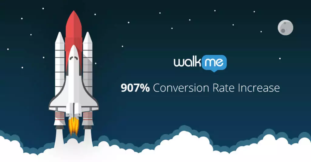
[thrive_2step id=’2101′]Not only was the conversion rate 907% higher[/thrive_2step]
than that of our control group, but our sales team also received much more qualified prospects.
Through reviewing and optimizing bi-weekly we were able to understand that the nature of this general information matters. Showing off our product was intrinsic in the Walk-Thru so to add on to this we showed users testimonials to build trust and current customers to show scale.
The users we were able to convert into potential customers had the opportunity to understand the product better and see the types of companies that had been successful with WalkMe. This information likely left an impression on whether they themselves fit into this profile.
Why it Worked
Focusing on building understanding, trust and community gently eased users into taking the next step in a way that made sense to them. Our conversion rate optimization was made possible through our ability to lead the right people down the path of least resistance.
Our “pitch” is not in-your-face. Instead we guide them in a more natural way. We created a balance between the user wanting to be educated and our objective of showing off our strong selling points.
It was also clear from our results that it was better for users to be shown general information than information that was irrelevant to them.
We were able to keep our customer-specific content for later stages in the funnel as well as information for returning customers, job seekers, news outlets, our blog readers and more. This information doesn’t have to be compromised to optimize lead generation.
In addition to conversion rate optimization, we were also able to enhance our UX by giving users the option to be shown the highlights of our website in an unobtrusive seamless path.
In staff discussions after our experiment we used the analogy of a backyard party, think of a pool party or a barbeque, to explain our results.
The goal was to get as many guests as possible from the front door, take them through the house and end in the backyard in a strategic way that resulted in the best possible party.
Option #1:
Let guests guide themselves from the front door to the party in the back yard.
But in this scenario our house is large and full of amazing rooms that the guest could get distracted in.
Option #2:
Have a guide meet guests at the door and walk them directly to the back yard.
While this is better than option one, we wanted to (and knew we could) do better.
Option #3:
Have a guide meet guests at the front door, take them into the kitchen to grab a drink, introduces them to a friend in the hall, and put a party hat on them just as they walk into yard.
This person has been primed to have a good time.
In option three, the guests are able to experience the best aspects of the first two options: they get to see the relevant parts of the house and are not lost or distracted on the way. They gathered just the right things needed, with nothing extra or missing, and were able to not only take part in the party, but actually enjoy and immediately join in the action.
(Our team also got to experience a party because our conversions were so high.)

How This Can Be Applied
There are a lot of UX solutions available but what sets WalkMe apart in the field of UX is its ability to focus a user on specific content amidst vast amounts of content without having to change the website itself.
This is especially valuable to enterprise companies that offer numerous products and services or face the same challenge that we did in explaining the nuances of what exactly we offer.
Being able to communicate the right message to the users, the users who can eventually become the best customers, is a challenge ripe to be overcome. However, it’s an integral step in conversion rate optimization efforts.
WalkMe is an easy to integrate solution to skyrocket the efficiency of your website and at the same time produce a deep understanding of the path that your most valuable users are taking prior to conversion. Plus, WalkMe offers every part of this process from the software to create the Walk-Thru to the analytics to measure its effectiveness. You can find more information and claim your free WalkMe account now by clicking here.
And, now that we are experiencing so many quality conversions, if you know any good sales or customer success people send them our way.


