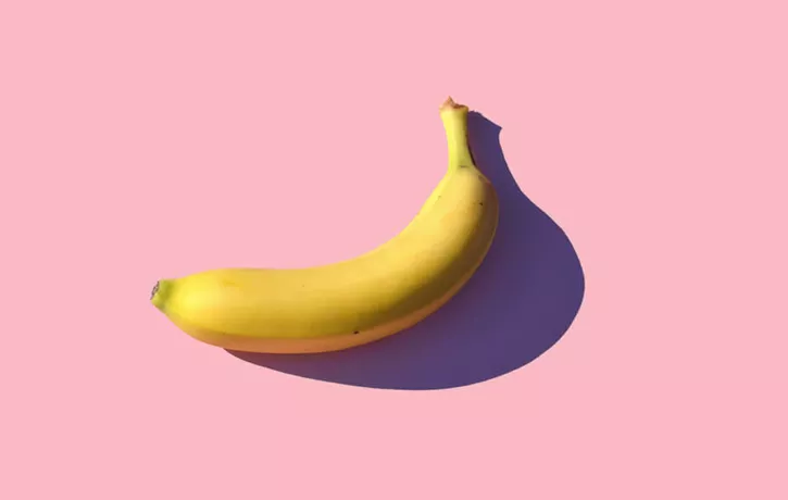
UX Designer to UX Designer, have you ever noticed the irony of describing what UX design is? At a recent cocktail party, I spoke over our fancy pink drinks towards the confused face looking back at me and realized that this, this very moment, was a terrible UX.
Being the diligent UX designer I am, I decided to design a method of describing UX that, in itself, provides a good UX for my audience.
Introducing “The UX of a Banana – Understanding What UX Design is All About”
Feel free to steal this explanation for your next UX small talk. It’s the UX description that avoids the technical jargon, gets the point across and is entertaining too. Go bananas.
WalkMe pioneered the Digital Adoption Platform (DAP) for organizations to utilize the full potential of their digital assets. Using artificial intelligence and machine learning, WalkMe adds a dynamic user interface layer to raise the digital literacy of all users.
Deliver a user experience with WalkMe that is as simple as peeling a banana.
Table of Contents
hide
The UX of a Banana
There’s a lot of fruit in the produce aisle, but if any one type of fruit was designed by Mother Nature for the user experience, it would have to be the banana. A banana tastes good and is good for you, but there are other factors of its design that add to this optimal experience of snacking.The Color of a Banana Makes it Easy to Know it is Ready.
Most of us will use our eyes to observe a banana long before we smell, touch, or taste it. Just by looking at a banana, there’s no question of if it’s ready or not. Bananas have a built in accurate visual cue. You don’t have to waste time questioning or testing to see if it is ready because it is designed to be obvious. They’re green before they’re ready, they’re brown once they’re past their prime, but that bright yellow peel means it’s at its best flavor and ready to eat.A Banana Can Be Eaten When and Wherever.
Not only does the peel of the banana show when it’s ready to be eaten, the peel also makes it super easy to take on the go and eat when you want. Bananas are mobile. The peel is thick and protects the fruit and when it is time to eat the banana, it peels easily without tools. To eat a banana, you don’t have to carry around a cutting board and knife. Bananas are not messy. You don’t have to wash them before you eat them and they don’t leave your hands a mess either. And neither the peel nor the fruit will stain you or your clothes.Bananas are easy to eat.
Once peeled, eating a banana is a seamless experience because there is nothing else in the way. There are no hidden seeds, a pit in the middle, or a core to work around. Biting into a banana is a comfortable and effortless experience. The user can enjoy every bite knowing there is only good flavor and good nutrition to come.Bananas Are Widely Available and Have Meaningful Effects.
Bananas are grown on every continent and are available worldwide, all year long and are inexpensive, making them accessible to just about everyone. Bananas are the only fruit containing the amino acid tryptophan and vitamin B6 which help produce serotonin. Serotonin alleviates depression which means that bananas can literally make you happy. And there’s also this bonus “feature” when you press directly on the end of a banana: it naturally splits into perfect thirds. It’s a little like finding one of those Google Easter Eggs designed for no other reason than for you to enjoy.Comparing Bananas to Other Fruit
Other fruit have their advantages, but when it comes to the entire experience… they all have some fault making them not quite as nice as the banana. Sure, there are fruits much prettier than bananas, but being aesthetically pleasing is a different kind of design. There are also fruits that have better nutritional value, but if nutrition were the only important part we might as well just take a vitamin. And there are definitely fruits that taste better than bananas, but taste is just one sense to experience a piece of fruit. UX design is about the entire experience from start to finish of consuming the product. Watermelons, cantaloupe, and honeydew are large and heavy. Just bringing them from the store is a chore. The range of berries all are small, but so delicate you need proper containers to transport them. Apples, pears, plums and peaches – if we’re not talking about their seeds, don’t forget you have to clean them before the first bite. The entire lineup of citrus fruits is a mess. Pomegranates are a pain to prepare. Do I need to go on?Relating Banana UX to Tech
Some UX designers work offline, but the majority of us work with digital products. The human-computer interaction or HCI has dramatically improved over the last ten, five, or even the last year in large part because of UX designers. If you navigate through an app or website with a smile on your face, there’s probably a UX designer out there who created the interface specifically for that reaction. The job requires that we understand the capabilities of the product, how the user will naturally act with the technology and connect the two with strategic design thinking. The unwanted popup after you already signed up? That’s spitting out a seed. But when a popup has the information you need in the exact moment you need it, that’s “Banana UX.”WalkMe pioneered the Digital Adoption Platform (DAP) for organizations to utilize the full potential of their digital assets. Using artificial intelligence and machine learning, WalkMe adds a dynamic user interface layer to raise the digital literacy of all users.
Want to improve UX? Find out how WalkMe delivers relevant information in real time.

