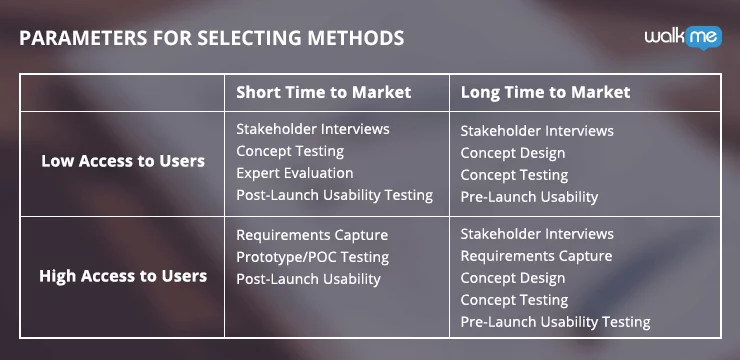
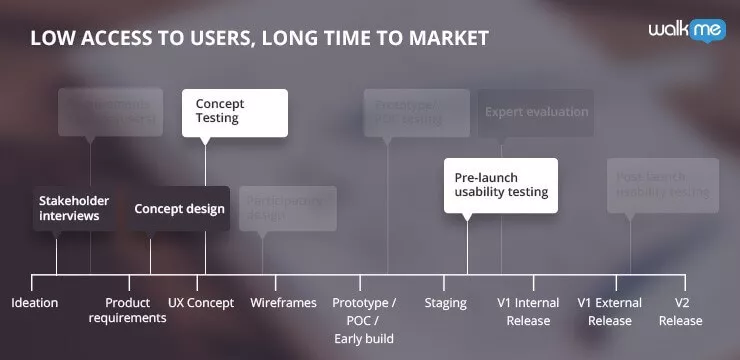
Product teams working with low access to users and a long time to market, usually enterprise level services and the like, need to make the most of their time, to compensate for access to users. Choosing the right combination of UX methods is the first step in making this happen.
Fortunately, we’ve already put together this UX Combo.


Use WalkMe’s customized onscreen guidance to attain an unforgettable user experience.
What You Need to Know About UX Combos
UX Combos are sets of UX methods that are grouped together to optimize UX efforts and results, based on access to users, time to market and the product timeline. At the beginning of the product timeline, you’ll need to determine which UX research and design methods are feasible and will benefit your product the most. Ultimately, there are two main factors that drive this decision: access to users and time to market. Read more about UX Combos, and each UX Combo from the list below: What’s Your UX Combo? Part 1: UX Methods for a Short Time to Market and Low Access to Users Part 2: UX Methods for a Long Time to Market and High Access to Users Part 3: UX Methods for a Short Time to Market and High Access to Users Part 4: UX Methods for a Long Time to Market and Low Access to Users
UX Methods for Low Access to Users & Long Time to Market
Given that your access to users is low, your choice of UX methods will need to make the most of the time you have until launch. UX Designers and Product Managers can use the following UX Combo to get the highest return on their UX efforts, or as we like to say, the highest “UX ROI.”- Stakeholder Interviews
- Concept Design
- Concept Testing
- Pre-Launch Usability Testing

First UX Method: Stakeholder Interviews
Stakeholder interviews do not require end-users and will help you with two objectives: understanding business needs and determining how you will measure success.Before You Start
For stakeholder interviews to be successful, prepare a clear agenda in advance. Make sure your questions are relevant to each stakeholder’s domain and seek out answers that show how they expect the product to serve their interests. For example, a business stakeholder may need the product to improve cross-sells, while a technical stakeholder might be concerned with overloading the database. Whatever the case may be, it is your job to find out exactly what these needs and requirements are, per their domain.Limitations
Stakeholder interviews are going to be a big help getting started, but be aware that your stakeholders will not be able to give you the user perspective. You will be able to collate the high-level business requirements, but not necessarily what the user wants.What to Focus On
Because this is your best opportunity to understand the business need, focus on that rather than the solution. Have stakeholders explain what they need, rather than how, and ask questions to gain a deep understanding. After it is clear what the stakeholders need in the product, define the key performance indicators (KPIs) that will be used to measure success; be specific, plan how and when they will be measured, and what is the leading indication for success. Stakeholder interviews are also a good time to bring up any elephants in the room. Big or small, allowing time to voice concern at the beginning of your product timeline will give you more time to address the issue. The last point to focus on in a stakeholder interview is the stakeholder’s level of commitment. Do they expected to be involved at any stage of the process or just at the end? Are they there for support, or should you expect to go elsewhere if needed?What You Gain
By conducting stakeholder interviews in this manner, you’ll be able to gain:- An understanding of the business context
- Measurable KPI’s
- List of worries and concerns to address

Second UX Method: Concept Design
The next UX method that can be done without users is concept design. Concept designs, also called wireframes, are high level conceptual mockups that are used to validate your ideas and begin the process of making your product a reality. The Concept designs process can be repeated throughout the product timeline, in case a tested concept does not hold water.Before You Start
Before you can start a concept design, you need to have a deep understanding of the business need and user and technical requirements. If you are using the UX Combo for low access to users and long time to market, then you should already have this information from your stakeholder interviews.Limitations
Concept designs are limited to high-level user journeys and are not the place to resolve granular details of your product. Take advantage of your long time to market to create detailed, functional mockups later on.What to Focus On
Put simply: keep things simple. Concept designs should be created with simple tools, from pen and paper to basic sketching tools, to avoid granular detail. Make sure you concepts are well differentiated, so during concept testing, participants can reflect on the alternative directions they represent, or the different mental models they assume. It’s advised to even create “wrong” versions, or at least what you perceive as wrong. By doing this, you’ll be able to validate your assumptions, and possibly come across viable alternatives.What You Gain
With concept designs/wireframes you’ll be able to:- Allows the Product Manager and UX Designer to see if concepts hold in practice
- Gives confidence in the chosen direction
- Deliver a clear set of high-level wireframes and flows
- Prepares team for concept testing with users

Third UX Method: Concept Testing
After you have conceptual mockups from the previous UX method, you can begin concept testing to validate your ideas and get user feedback. Concept testing is done with real users, or the closest you can get to real users. If you have NO access to users whatsoever, you should use a method called Heuristics/Expert evaluation, in which a fellow UX designer/researcher reviews your concept in the light of generic UX guidelines.Before You Start
Prepare your early stage sketches for concept testing, but don’t invest time and effort into more detailed mockups. It is important, however, that whatever text and/or images are represented in the concept, should be realistic, names of features, content, etc. You’ll be surprised to know how wrong or generic text (lorem ipsum style) confuses users, despite a correct interface. The goal here is to only convey the high-level solution, allowing for open feedback and even new ideas. Having too many details in your mockup may de-focus your participants, and make them reflect on the less important things. t.Limitations
The inherent limitation of concept testing is that it only provides feedback on the high-level ideas of your product. You many get the concepts right, and still get it ‘wrong’ on the lower-level usability, later on. That’s why pre-launch usability testing is coming up next. In the scenario where your access to users is low, concept testing will also be limited by the biases of the “stand-in” users.What to Focus On
While you present your concepts to your users, focus on gathering feedback on where the strengths and weaknesses are in each one. This way you can possibly mix-and-match parts of the solution later, instead of purely selecting A or B. Make sure you capture your users’ first impression to determine what is immediately obvious. If you are not able to test with real users, try getting a diverse group of “stand-in” users from around the office, but aim to a similar-level knowledge and domain experience.What You Gain
Through concept testing you’ll be able to:- Gather feedback before time and resources investments are made
- Validate concepts from the user’s perspective
- Understand the pros and cons of different design options
- Base design decisions on qualitative data
- Improve concept designs

Fourth UX Method: Pre-Launch Usability Testing
Usability testing is best done with real users, aka participants. When your access is limited but you do have a long time to market, use that time and prioritize this testing to bring in a representative selection of users. Pre-launch usability testing requires a lot of time in advance to coordinate and prepare, and a lot of time after to gather findings and implement the generated solutions. Factor this in during your product timeline planning, to make sure your users’ valuable feedback isn’t lost.Before You Start
Recruiting users is one of the biggest challenges of pre-launch usability testing. The required effort will differ based on the availability of users, namely time, place and uniqueness of users. Another challenge for this UX method is in recording the sessions. You’ll want to prepare a way to record that makes it easy to review later, and there are quite a few tools in the market to do that. Having other UX and product professionals as well as members of the R&D team, can be extremely helpful in providing another angle, removing biases, and generating more ideas out of the same, costly, user sessions.Limitations
Pre-launch usability testing is an effective way of getting user feedback, but observing circumstances in a “lab” environment will not produce the exact results that happen during real use. For this reason, it is best to focus on making sure the interface addresses users’ intent, even more than the actual execution.What to Focus On
At the beginning of the session, take time to understand the atmosphere, circumstances and intent each participant has in using the product, as well as how this differs for each use case and persona. Capture first impressions to get the participants’ gut-feelings in the first few second of seeing the product. After you ask questions about their first impression, allow participants more time to digest and complete tasks. During this, ask them to think aloud so that you can capture what they say and how they say it. From this you can get an understanding of what the user finds confusing, frustrating, simple, and obvious. Before participants leave, have them summarize and clarify the highs and lows of their experience and what you observed. What’s ‘left’ from the experience is usually what really counts.What You Gain
By conducting pre-launch usability testing with just five or six target market participants, you will be able to:- Deeply understand Why users do or do not take specific actions
- Identify roughly 50-60% of your user experience issues
Want to boost your UX? Try WalkMe’s guidance platform today.


