This is the worst UX scenario for Designers and Product Managers alike.
Circumstances have given you a tight deadline to meet and little access to users for feedback. How, then, do you approach this project, UX wise?
This is exactly the situation UX Combos were created for. After acknowledging your limitations, it can decisively help you select the right UX methodologies. This blog post will cover the UX methods included in the UX Combo for low access to users and a short time frame.
This is the first of a series of blog posts we will be writing on each of the four UX Combos.
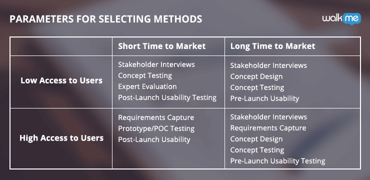 Today, we’ll be discussing the UX Combo used when you have low access to users and a short time to market. But also be sure to check out the deeper look at UX Combos with the links below:
What’s Your UX Combo?
Part 1: UX Methods for a Short Time to Market and Low Access to Users
Part 2: UX Methods for a Long Time to Market and High Access to Users
Part 3: UX Methods for a Short Time to Market and High Access to Users
Part 4: UX Methods for a Long Time to Market and Low Access to Users
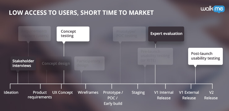 There are four methods that make up this UX combo:


Refine your UX today using WalkMe’s onscreen guidance.
What’s Your Combo of UX Methods?
Every product is created over the course of a product timeline. At each stage—research, design, and testing—multiple UX testing methods can be used to improve the product. The problem is that there are a lot of methods to choose from, but not all of them are fit for every scenario. Some options might get you the best feedback on your product, but take too long to complete before a product launch. Some may be quick to finish, but require interactions with users that are not always accessible. A UX Combo takes into consideration the most important parameters for choosing UX methods, namely, access to users and time to market, and narrows down which methods are fit for your circumstances. The final combination is your UX Combo. Today, we’ll be discussing the UX Combo used when you have low access to users and a short time to market. But also be sure to check out the deeper look at UX Combos with the links below:
What’s Your UX Combo?
Part 1: UX Methods for a Short Time to Market and Low Access to Users
Part 2: UX Methods for a Long Time to Market and High Access to Users
Part 3: UX Methods for a Short Time to Market and High Access to Users
Part 4: UX Methods for a Long Time to Market and Low Access to Users
UX Combo for Low Access to Users & Short Time to Market
When users are hard to access, and you have a short time to market, you’ll need a UX Combo that is quick to finish and only requires the resources you already have. There are four methods that make up this UX combo:
- Stakeholder Interviews (no users involved)
- Concept Design (no users involved)
- Concept Testing (with users)
- Post-launch Usability Testing (with users)

First UX Method: Stakeholder Interviews
Stakeholder interviews are done to understand the business needs and how you will measure success by determining Key Performance Indicators (KPIs).Before You Start
Make sure you have an agenda before you begin. Prepare questions that are specific to each stakeholder’s domain (e.g. business, technical, etc.) and how they expect the product to serve them or their interests. For example, a business stakeholder may be interested in achieving specific results, while a technical stakeholder may stress the need for a ‘light’ implementation that doesn’t overload the database. You’ll also need to prepare your questions to promote design differentiation and priorities. Discussing these options will help you obtain the detailed need from the targeted stakeholder, as opposed to the non-directive “we want more” approach.Limitations
While stakeholder interviews are extremely helpful for your UX Combo, they’re all about what the company wants to get from the product. They ignore both user needs, and how they want to get it. Therefore the stakeholder interviews are a baseline/guidelines for your work, but not the end of it.What to Focus On
During the interviews, it is critical that you maintain a clear focus on the business need—rather than the solution. Engaged stakeholders (especially founders) tend to quickly jump to solutions, but your understanding of their need will ultimately give you a deeper perspective to base your solution on. Next, learn and define how success will be measured. Set specific KPI’s and plan how these will be measured. This point doesn’t always come up at early stage, but for sure will come up later, after launching, so you better plan for it. Stakeholder interviews are also the best time to address any elephants in the room, e.g. we don’t currently have any users, we’re not sure about our target audience, etc. Allow room for concerns and worries to be expressed. Then use this time to address these issues. Finally, stakeholder interviews should be used to confirm levels of involvement and commitment from your stakeholders, meaning, do they expect to be involved in any stage? Just the end result? Setting the right expectations here can solve a lot of misunderstandings later, and can also point you to the people that are truly involved, when you need supportWhat You Gain
By conducting stakeholder interviews in this manner, you’ll be able to gain:- An understanding of the business context
- Measurable KPI’s
- List of worries and concerns to address

Second UX Method: Concept Design
Concept design and/or wireframing is a practice where you create conceptual mockups (high-level designs) so you can see if they hold any water, and validate them with potential users.Before You Start
To get started on a concept design, you’ll first need to have an understanding of your business requirements, user requirements and technical requirements. You’ll use this to both drive the design and to question its validity.Limitations
Concept designs are important to validate a high-level solutions and designs, but don’t expect to get insight into lower level or granular usability.What to Focus On
Using simple tools like pen & paper will help you focus on high level ideas rather than digging into minute details. By doing this you’ll be able to get a larger picture of what needs to be done, which is a more efficient way of getting to your minimum viable product. Of course, you’ll want to focus on designing the best paths for users, but also designing “wrong” versions can help you too (you’ll be surprised…). You can validate your ideas by having a better understanding of why alternatives should not be pursued in development.What You Gain
With concept designs/wireframes you’ll be able to:- Allows the Product Manager and UX Designer to see if concepts hold in practice
- Gives confidence in the chosen direction
- Deliver a clear set of high-level wireframes and sometimes flows
- Prepares team for concept testing with users

Third UX Method: Concept Testing
Concept testing allows users to provide feedback for your suggested solutions. In cases where you don’t have any access to your actual users, grab someone who’s as close as possible to the user’s profile. If you can, grab another team member (ideally UX or Product Manager) to view the session, so you can eliminates your own bias.Before You Start
For concept testing, you want to deliberately use early stage sketches. You do need prepared preliminary concepts, but don’t invest time or resources to develop the idea more than necessary to convey the premise. It has been proven that the more ‘sketchy’ the wireframe looks, the easier it is for a participant to provide feedback. When things look ‘finalized’, people tend to be ‘easy’ on the researcher and only suggest minor changes. This gives you the flexibility to use this feedback to change ideas before your time and resources are spent.Limitations
Because the concept designs from before omit lower level usability details, concept testing will also lack the information to get feedback on the exact ways a user could or would complete a certain task. This should be left to the later-stage usability testing on the real product.What to Focus On
Present a few concepts if possible. This will give you the ability to compare your ideas and see where the strengths are in each one. Focus on the user’s first impression to test if your main objects are immediately obvious and available. Also consider using a survey after the session to standardize and quantify your results. This will help you remove any personal biases.What You Gain
Through concept testing you’ll be able to:- Gather feedback to use before investments of time and resources are made
- Validate concepts from the user’s perspective
- Understand the pros and cons of different design options
- Base design choices on qualitative data
- Improve concept designs

Fourth UX Method: Post-launch Usability Testing
Usability testing requires users. Again, if you don’t have the ability to test with your users, try to find the next best thing. It won’t be an equal substitute to have a UX friend give you feedback, but it can still add value and insight. During the session, have your users complete tasks and closely observe their processes. Keep note of where they are quick to understand what to do, where they hesitate, where they make errors, and especially where they are unable to complete their objectives.Before You Start
The largest hurdle for post-launch testing is preparation. Start early and plan enough time to recruit users, conduct testing and implement findings (meaning development time). Each of these is essential to gain this method’s value. You’ll also need a means for recording the sessions so you can re-review them or share with colleagues/management. Having a second UX Designer or Product Manager to help you observe and record can prove to be as powerful as having more research participants. In addition, inviting R&D team members will take you a long way in motivating them to make the right decisions when building.Limitations
Understand that a user being observed in a “lab” environment will not exhibit exactly the same behavior as they would in normal circumstances. Anticipate how lab conditions differ from real use cases, and make sure you focus on users intent, more than execution. Post-launch testing can also be very time-consuming. Under a tight deadline, you’ll need to prioritize the time you dedicate to this method and justify it by having a sharp focus on what value you are getting out of it. A round of testing users can also produce an overwhelming amount of information. This can be difficult to manage with a fast-approaching deadline. Carefully and strategically prioritize your findings that you can take action on within your time frame.What to Focus On
During your post-launch usability testing, make the effort to understand the circumstances your participants are bringing to the table. This refers both to their background (e.g. for a sophisticated product, do they have tech background?) and their usage scenario (e.g. for e-commerce, are they going in for two minutes to to grab something while at work, or are they in for significant research on a Sunday morning). Make it an absolute priority to capture first impressions. Try to ask this three seconds into their first view of the web/app. This provides you with a fairly ‘clean’ take on their gut-feel, before they dive into detail. It also helps in evaluating the UI aspect of the design. Ask participants to think aloud as they complete a few tasks. Not only will you have the information they are deliberately saying, you’ll also be able to read into their tone, volume, and how quick they are to mention what comes to mind. Summarize the session with the participants to clarify “highs and lows” and to understand their impressions they are left with.What You Gain
By conducting post-launch usability testing with just five or six target market participants, you will be able to:- Deeply understand “Why” users do or do not take specific actions
- Identify roughly 50-60% of your user experience issues

