What is a modal window
A modal window is a special pop-up box that appears on your screen when you’re using a computer program. You have to deal with it before you can go back to using the program. These pop-ups show important messages, alerts, or ask you for something, like typing in information. They stop you from doing anything else in the program until you deal with them.

Modal windows usually have buttons like “OK” or “Cancel” that you can click on. They help you notice important information without making the program screen too cluttered.
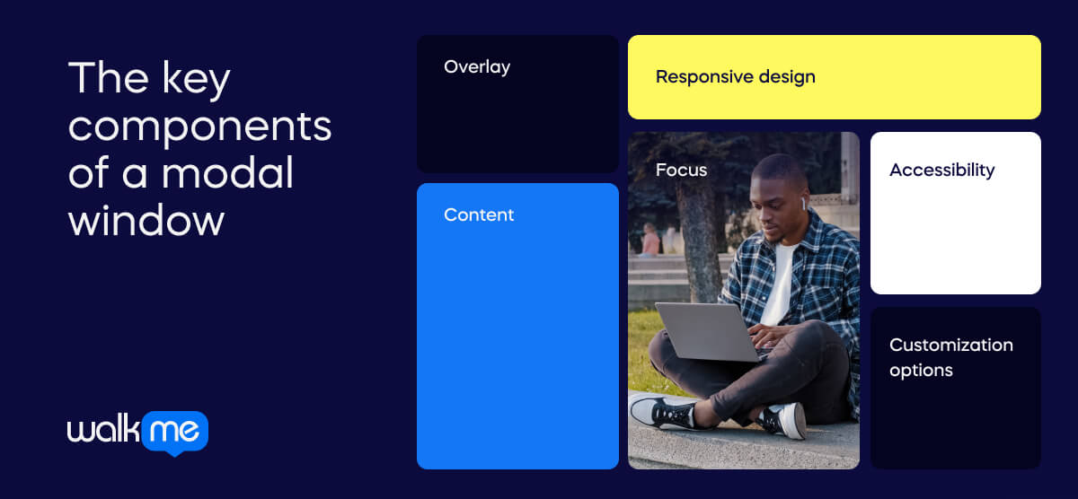
What are the key components of a modal window?

Modal windows have several distinct features which make them unique. They are unlike other pop-ups, so it’s important to understand how they work. Many businesses use modals to progress specific goals such as training or sign-ups. These are the features that make such processes possible:
Overlay
Modal windows usually appear on top of the main webpage, with a see-through layer behind them. This layer makes the modal window stand out, so you notice it more.
Content
Modal windows show important details that need your immediate attention or action. This can be text, forms, pictures, videos, or anything else you need to see or do something with.
Responsive design
Modals need to fit nicely on all screen sizes and devices. This means they should adjust to different screen sizes without being hard to use.
Focus
Modals grab your attention and stop you from clicking on elements outside them until you close them. This is done by making everything else inactive while the modal is open.
Accessibility
Modals must work for everyone, including those using tools like screen readers. This means making sure all the elements in the modal are labeled correctly and that you can move around using just the keyboard.
Customization options
Modals can be changed to fit what you need. This might mean adjusting the size, look, or how they work. Designers can do this to make the modal fit their website or app better.
Modal windows vs. popups
Modal windows and popups are common elements in web design. However, they are not the same.
- Modal windows appear at the top of the main content. The user has to interact before it will disappear.
- Popups will sometimes appear unexpectedly. They can be minimized if the user does not want to interact.
Here’s a more detailed breakdown of the key differences:
| Modal windows | Popups | |
|---|---|---|
| Definition | Special boxes appear at the top of a webpage or app, often requiring you to do something before you can continue using the page. | Small windows that suddenly show up on a webpage, usually because you clicked something, and they can show different things like ads or alerts. |
| Focus | They help you focus on a specific thing by covering the rest of the page until you deal with them. | Can take your attention away from what you were doing by showing up unexpectedly. |
| Techniques | They often use effects to stand out from the rest of the page and ensure you see them. | Can be made using different methods like special code or animations. |
| Goals | They aim to guide you through something important without distractions. | Popups can have many goals, like showing ads or getting you to sign up for something. |
| Examples of use | They’re used for things like logging in, confirming actions, showing pictures, or guiding you through steps. | Popups can be found in ads, sign-up forms, chat boxes, cookie notices, or showing download progress. |
Special boxes appear at the top of a webpage or app, often requiring you to do something before you can continue using the page.
They help you focus on a specific thing by covering the rest of the page until you deal with them.
They often use effects to stand out from the rest of the page and ensure you see them.
They aim to guide you through something important without distractions.
They’re used for things like logging in, confirming actions, showing pictures, or guiding you through steps.
Small windows that suddenly show up on a webpage, usually because you clicked something, and they can show different things like ads or alerts.
Can take your attention away from what you were doing by showing up unexpectedly.
Can be made using different methods like special code or animations.
Popups can have many goals, like showing ads or getting you to sign up for something.
Popups can be found in ads, sign-up forms, chat boxes, cookie notices, or showing download progress.
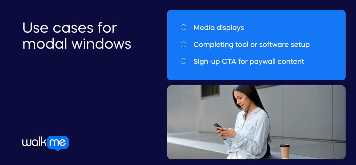
Use cases for modal windows

We encounter modal windows all the time, sometimes without even realizing it. They help encourage or enforce specific actions on a webpage. It can be difficult to understand how modals work without context, so here are three examples of how they may appear.
Media displays
- When a user is on a web page, they click a button to open a slideshow.
- The slideshow appears as an overlay on the screen.
- They can view the slides in a focused way without leaving the webpage.
- There are controls within the modal window to help them navigate through the media content.
- They need to close the modal to return to the main page.
Completing tool or software setup
- Modal windows may be used if a tool or software setup process requires multiple steps.
- When users begin the setup, they are taken to a modal window with content they must interact with.
- They must complete the interaction on the modal to move to the next window.
Sign-up CTA for paywall content
- A user may click on an article on a news site behind a paywall.
- A modal window will appear, blocking the content and encouraging users to sign up or log into their accounts.
- The modal window cannot be minimized—the user must interact with it in one of these ways to access the article.
- If they do not want to interact with the modal, their only other options are to click away from the page or click on a different webpage.

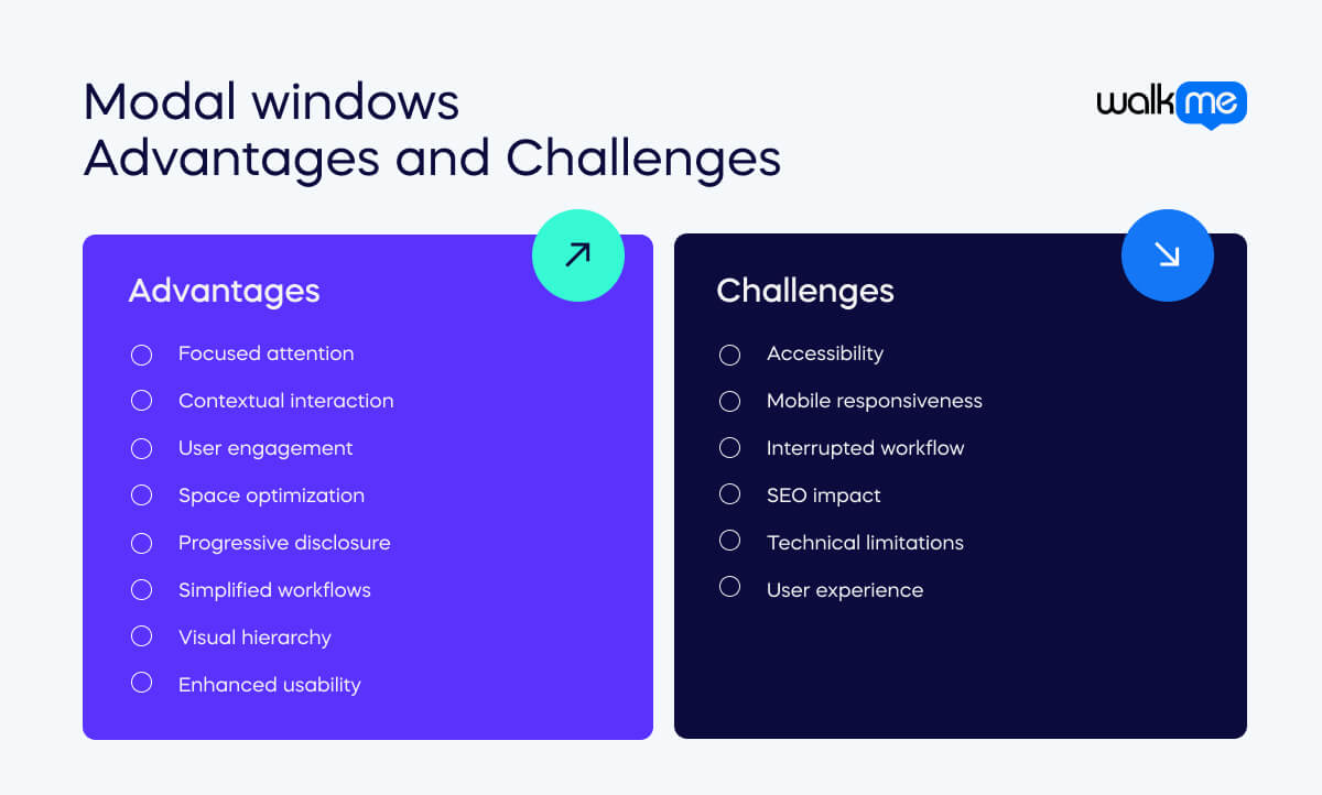
What are the advantages of modal windows?
Modal windows offer many benefits for improving website and application user experience (UX). By using them well, businesses can make it easier for users to complete tasks and make their websites more enjoyable. Let’s examine the various advantages modal windows offer and how they help create more effective user experiences.
Focused attention
Modals grab your focus by showing important elements in a separate box on the main page.
User engagement
Modals encourage you to click on a button or fill out a form, which helps you become more involved with the website or app.
Progressive disclosure
Modals reveal information or options bit by bit, so you don’t get overwhelmed with too much at once.
Visual hierarchy
Modals help you understand what’s most important on the page by separating less important elements from the main content.
Contextual interaction
They create a special area where you can do something specific, like sign up for a newsletter or answer a survey, without being distracted by other elements.
Space optimization
They save space on the screen by popping up with extra information or options instead of making you go to a different page.
Simplified workflows
They make it easier to do multi-step tasks, like filling out a form, because everything you need is in one place.
Enhanced usability
They make things easier to use by providing clear instructions and keeping them consistent across the website or app.
What are the challenges of modal windows?
Modal windows can be difficult to set up and use. Businesses will try to improve user experience by using them, but there can be problems along the way. It is important to understand these challenges to ensure modals work well and don’t cause issues for people. Here’s a breakdown:
Accessibility
They can be difficult for people with disabilities to use. For example, people using assistive technology like screen readers may struggle to use the site.
Interrupted workflow
If a modal window appears unexpectedly and has to be dealt with, this can frustrate users.
Technical limitations
Rolling out modal windows could require advanced coding skills. Furthermore, they may not work with certain platforms.
Mobile responsiveness
The windows may not work well on smaller screens or mobile devices. This could cause issues for users.
SEO impact
The content shown in modal windows may not be visible to search engines. This could mean that important information isn’t shown to users.
User experience
If modal windows are not designed well, they could confuse users or make it difficult for them to complete tasks. This leads to the overall experience being negative for the user.
How can DAPs be used to roll out modal windows?
Digital adoption platforms, or DAPs, are useful for rolling out features that require modal windows. As we explore below, the platform helps speed up employee understanding of software or tools. By rolling out interactive guidance, workers can adapt to a new system without taking time out of their daily work for training. As modal windows must be interacted with to progress, they can be layered as step-by-step guidance to assist understanding. Let’s take a look in more detail.
Interactive onboarding
Modal windows are used for interactive onboarding. The DAP will overlay models on the screen, ensuring users immediately focus on them. To progress through the onboarding process, the user must click through modal windows presented as step-by-step instructions.
| How can WalkMe help?WalkMe uses Smart Walk-Thrus, which appears as a modal window on the digital adoption platform. Users are guided through an interactive session, and as a result, they are less likely to need training or support. |
Success stories with modal windows
Deloitte made use of Smart Walk-Thrus with WalkMe. These modal windows allowed them to accelerate their digital transformation and easily shift to the cloud. Here’s how:
Deloitte x WalkMe
Deloitte introduced several new technologies as part of its digital transformation. However, whenever they moved to a different system, employees spent a large portion of their me learning in a physical classroom w WalkMe was used with Deloitte’s new auditing software. The DAP provided in-app learning with step-by-step Walk-Thrus. With this onscreen guidance, employees could deliver quality to clients while adapting to new tools in real-time.